The LMS platform was outdated. The UX Design Team was asked to create a new design system with new components and a new look and feel. The Design Team began work on a new UI Design system. Research partnered with the Design Team to understand if the proposed changes were preferable to the current system design. I was tapped to launch a series of studies to gauge user sentiment to the new ideas. How did users feel about the new ideas? Will the users prefer the new design system? I set about to find out.
There were a number of reasons why a new design system was necessary. Consistency, updates, and faster iteration across the UI were among the reasons. A new design system would allow the design team to refresh the UI, build a new shared component library, and standardize the experience across the LMS. When I joined the project, the Design Team had some early stage designs for which they wanted feedback. I met with the Director of UX, my primary stakeholder, to understand the ask and formulate a plan. His hypothesis was that the Team was on the right path, the new designs would be received well, and the design team should push forward.
To find out if this hypothesis was true, I met the Director of UX several times to discuss the research project. We wanted to conduct a study to compare the "New" design frames against the LMS's "Current" design frames. By the conclusion of this project, I ran three separate studies. After the 1st study, I realized we were getting the quantitative data we needed, but not the qualitative data. Between Study 1 and Study 2, I amended the plan from an unmoderated (Study 1) to a moderated study so I could probe the participants and ask why they made certain choices and which design frames they preferred. I also changed the number of participants after Study 1. Study 1 contained 30 participants (10 internal, 10 new hires w/ little exposure to the platform, and 10 Userlytics participants with no exposure to the LMS). Study 2 and Study 3 contained 10 participants each; five internal team members and 5 Userlytics participants with no affiliation to the platform. I used internal and external participants to account for familiarity bias in all studies. I decreased the number of participants in Study 2 and 3 due to time constraints and the need to get feedback to the design team in an effort to help determine next steps. Study 2 provided more insight into the user's rationale. I then launched Study 3 to validate the results from Study 1 and 2.
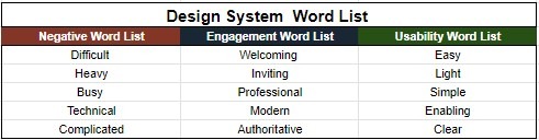
One unmoderated and two moderated studies comparisons in a testing platform called Userlytics helped to complete this project. I used Figma frames from each design system to share with participants in the studies to gauge how participants felt about each system. The Figma frames were of the exact same page from the LMS. I ensured each frame had the same zoom size during the study. I also alternated which frame each participant viewed first to account for order bias. Each user was presented with a frame, then asked to select five words to describe how they felt about the frame. Participants were asked to select five words from a choice of fifteen. The fifteen words were categorized into three categories: Negative, Engagement, and Usability. The Negative word category word selections were Difficult, Heavy, Busy, Technical, and Complicated. The word choices for the Engagement category included Welcoming, Inviting, Professional, Modern, and Authoritative. The word choices for the Usability category included Easy, Light, Simple, Enabling, and Clear. The word count tallies (the five words selected by each participant) would be compared at the end of each study to determine which designs scored higher in Negative feelings, Engagement feelings, and Usability feelings. Last, I randomized the word list for each participant to ensure there was no order bias in word selections.
I used Notions to document my tasks, their status, and completion of the tasks for this project. I have also used Airtable, Salesforce, and Trello for this purpose.
The Director of UX and I devised a word list for participants. The words selected were intentional and were used to allow participants to convey their impressions of the current versus the new UI designs. Each participant was asked to select five words during the testing. The word tallies were then counted and compared to determine which designs scored higher in Negative, Engagement, and Usability sentiment.
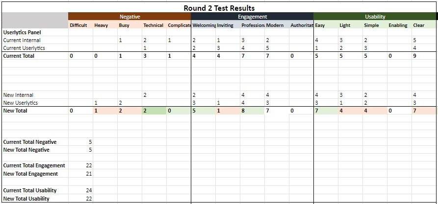
In Study 2, I changed from an unmoderated to a moderated study, pared down the number of participants, and was able to gather more insight into why word selections were made. In round 2 of the study, The Negative word selections and sentiment were tied 5 - 5 between the Current and New design frame. The Current design frame still slightly edged out the New design frame 22 - 21 in Engagement feelings. In this study, Usability for the Current design frame collected more word tallies than the New design frame 24 - 22 which was different than Study 1 results. Because it was a moderated study, I had the opportunity to question why certain word selections were made. As I reviewed the feedback I also created a Figjam board to capture important quotes and sentiments.
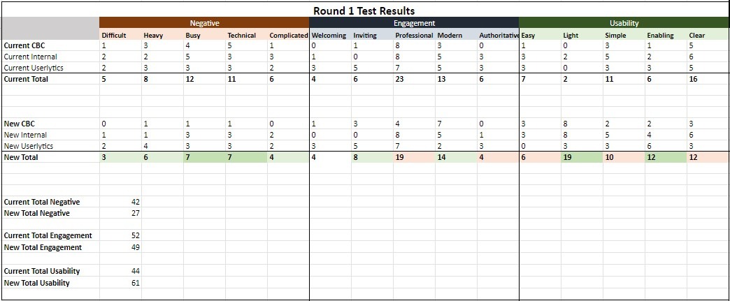
The results from Study 1, an unmoderated study, revealed that participants had more negative feelings about the Current design than the newer design by a word tally count of 42 to 27. More participants associated the negative words with the Current design frames than the New design system frame. The Current design frame also scored slightly higher in the Engagement word selections with a score of 52 to 49. In the last word category Usability, the New design system frame outperformed the Current design frame 61 to 44. While this was mostly good news for the New design system frame, I needed more insight into why the word selections were made.
FigJam notes from Study 2.
Study 3 was conducted as a validation study. This study echoed the results from Study 1 with the Current design frame scoring higher in Negative and Engagement. The New design frame scoring higher in Usability 22-13. I continued to capture the quantitative data from the participants in a FigJam board.
FigJam notes from Study 3.
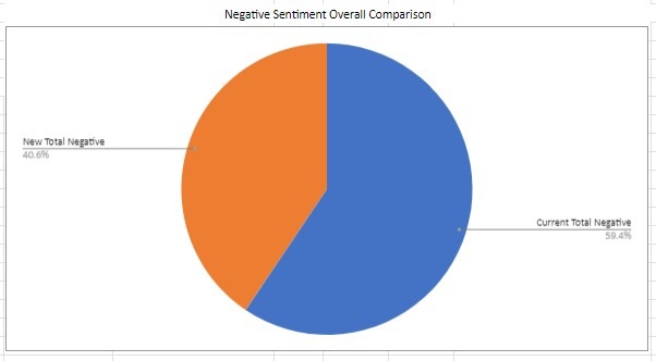
This chart was used to analyze the quantitative results with my primary stakeholder. The Current LMS design frames collected approximately 60% more Negative feeling sentiment across all studies. Next, the Current design frame scored slightly more Engagement sentiment feelings topping the New design by 8 points across all studies. While the Current design inspired more Engagement, the margin was slim. In Usability. the New design system frames garnered more word tallies across all three studies. We also discussed the qualitative results. Overall, the Current design was seen as "easier" to understand how to navigate. This was associated with the use of color to help direct the eye to a starting point. Users who preferred the New design frame remarked that it felt "bright" and "airy" but did not direct the eye to a starting point. All of this feedback was shared in a final report out with the primary stakeholder and the design team.

The new design library is an ongoing project for the UX Design Team. The design library aims to update the existing platform pages. UX Research is partnering with the Design Team to understand how the changes thus far impact the users. Three studies were conducted in total. Study One of the testing compared the current design pages against the new design pages and attempted to gauge how users felt about the newer designs and whether they found the changes more negative, more engaging, and/or more usable than the current designs. Study Two of the research was an attempt to incorporate why users specifically selected the word choices in a moderated study. Study Three of this series of studies attempted to determine if the results from Study One and Two can be validated. Study Three will parallel studies Study One and Study Two and seek to gauge participants feedback by sharing two design frames asking to make word selections from the same list of words used in the two previous studies. (The word choices are grouped into the categories Negative, Engaged, and Usability.) These participants will also be asked to explain why they made their word selections. The word choice selections will be tallied to provide quantitative data for this study, and the sentiments (or whys) expressed by the participants will be evaluated as qualitative data. The results will be calculated and compared to the previous studies.
My name is [Angela Battle]. I am joined today by my colleagues [names] who will be observing our session today. We are user-experience research professionals. Our job is to connect with participants like you and learn about what makes a website or program more appealing to you. We are meeting with you today to gauge your reactions to a couple of design frames. We hope to learn more about how we can improve the experience of these pages so that we can enhance them in the future.
This session will last no more than 30 minutes. Please feel free to express your opinions and views clearly and in detail. We'd like to ask you some questions about a few web pages. Please note, there are no right or wrong answers; we are just looking for your honest feedback.
We’d like to record this session to allow for analysis and transcription at a later date. Your name and likeness will only be used for review internally. May I have your permission to record?
Take a moment to review the webpage. I want to gauge your initial reactions to the page. How does the page make you feel? Review the word list below to describe how you feel about the layout and design of this web page. The next task will be to select five words from a list to help you describe how you feel about the page.
Make your selections from the word list below to describe the feeling you received from the design layout on the previous image. You must select five words from the list. Once you select five words, you will proceed to the next image.
Simple
Heavy
Clear
Modern
Welcoming
Busy
Easy
Professional
Light
Inviting
Difficult
Enabling
Technical
Complicated
Authoritative
What qualities of the first design - good or bad - contributed to your selection of your word choices?
What qualities of the second design - good or bad - contributed to your selection of word choices?
**Do you have a preference for visual appeal between the two design frames?**
**Can you articulate why?**
Thank you for participating in this study.
How does the Current design stack up against the new design? Three studies have been launched to understand what users felt in a comparison of design frames from each system. After three separate studies, the quantitative and qualitative results from the studies have been compared. The quantitative and qualitative results of Round Three of the Sentiment Study largely validate the results from the two previous studies.
Finding 1
The Current design frame scores higher in negative word associations than the new design frame. This is a win for the New designs.
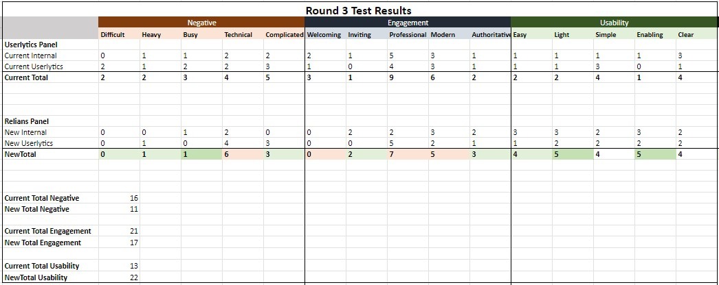
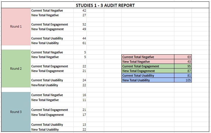
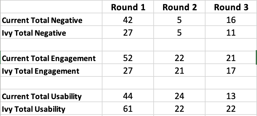
In the Negative word category, each study indicates that the participants selected words that inspire more or equal value of negative feeling words about the current design. In Study One, the negative word count was 42 – 27 with the current design garnering the higher score. In Study Two, the count was evenly split at 5 – 5 between the current design and the new design. In Study Three, the tally was 16 to 11 with the current design scoring higher than the new design. (The Negative category included the words Difficult, Heavy, Busy, Technical, and Complicated.) What this indicates is that more participants felt the new design was less Difficult, Heavy, Busy, Technical, or Complicated. This is a win for the Design Team, as the participants overall felt less inspired to use negative words to describe the new design frame.
Finding 2
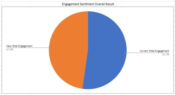
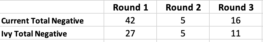
The next category to compare was Engagement. For the third time in a row, the New frame was bested by the Current design frame. (The Engagement category of words included the words Welcoming, Inviting, Professional, Modern, and Authoritative). In Study One, the score was 52 to 27 for the Current design frame. In Study Two, the score was 22 to 21 for the Current design frame. Then again, in Study Three the Current design beat the New design frame at 21 – 17.
Finding 3
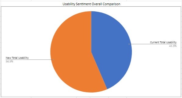
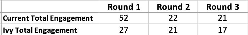
In the third category, Usability, the New design frame scored higher two out of three times taking rounds one and three. (Usability words included Easy, Light, Simple, Enabling, and Clear.) In Study One the New designs were the clear winner with a score of 61 to 44. In Study 2, the Current design edged out the new design with 24 – 22. In the last round, the New design again topped the current design 22 – 13.
Finding 4
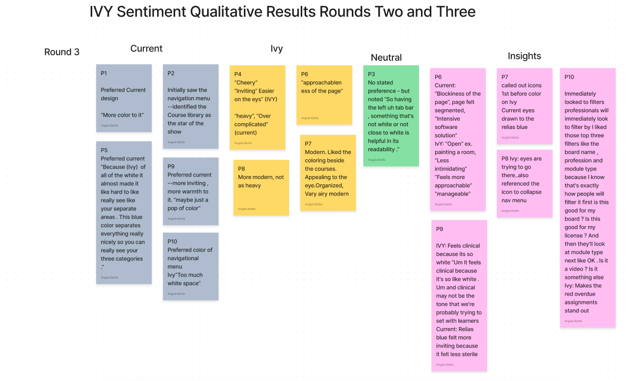
The qualitative data has also been compared. (The qualitative data, the why behind the selections, was only captured in Study Two and Three and Study One will not be referenced here.) The qualitative results are listed below.
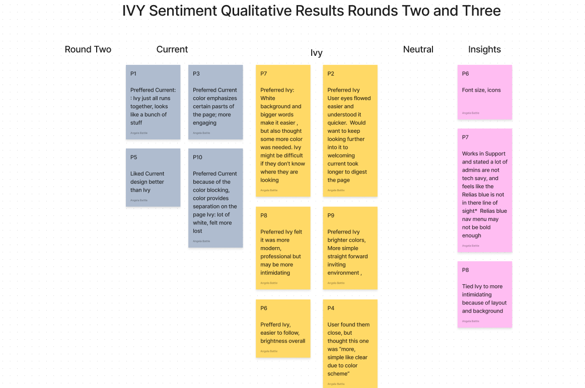
The Round Two and Three qualitative results indicate:
A. Participants who preferred the Current design did so because of the blue in the navigational menu. They believed the color “provides separation on the page”. Another participant remarked "This blue color separates everything nicely so you can see your three categories”. The blue navigational menu directed their attention on the page. These participants also believed the new design contained “too much white space” and that it all “runs together”.
B. Participants who preferred the New design continued to use the terms “bright,” “simple”, and “easier on the eyes”. One participant equated it to painting a room and the room feeling more open. They felt the Current design was “heavy”, and “Over-complicated”.
C. When asked about a preference for design frames, participants in Study Two and Three, (20 participants total), were nearly evenly split 10-9 in favor of the New design. (One participant was categorized as neutral because they did not express a preference either way).
D. The font size and the icons are a hit with users in the New designs. Several of the participants made comments about the font size and the icons. They really like the icon that collapses the navigational menu.
Tying the Findings to the Recommendations
We now know, after three rounds of testing, that participant’s eyes are still drawn to the blue in the Current design. Of the participants who preferred the Current design, it was the blue that helped them to visually navigate and make sense of the page. As from Study Two, the recommendation here would be to find a way to emphasize the desired components of the page in the new designs so users better understand where to direct their attention when they review the page.
The users who preferred the New designs really liked the openness and brightness of the design. It felt more “approachable and manageable” according to the participants in the study. They really liked the font changes, icons for the collapsable menu, and felt the overdue assignments were easier to see. Overall, they liked the visual ques that helped them to identify components and on the page. Build on that.
Another insight gained from the study was mentioned by a participant in describing the tech-savviness of the users. While this study can neither confirm nor deny the comfort level of administrators or learners using our platform, it is clear that our users want to quickly identify what they need to find on a page. While the page may contain many components, the ones they seek need to stand out and command attention. In a broader sense, the recommendation is to be sure to make the component (s) on the pages easy to see, find, and draw their attention.
Quick Wins
As in the previous studies, the quick wins remain the font size and icons. The filters are also an important quick win.
Long term wins
For the long term wins, if the Design team can find a way to de-emphasize the white space and get users to focus on the more important components of the page, they will be big wins.
There were no identified study limitations. Future research considerations include the same research considerations from Round Two of these studies. Once the Design Team has determined and executed a strategy to better direct the user’s attention, an additional round of studies can be launched to determine how effective the strategy has been.
The results across all three studies are basically the same, and the new design typically wins in two of the quantitative categories compared; the Negative and Usability categories. The New design frame came in second in the Engagement category in each of the three rounds of testing but it was close. The New design is still not provoking enough participants in the Engagement word category.
When comparing qualitative data from Rounds Two and Three, there was an even split. In Study Two more people preferred the new design frame. In Study Three more people preferred the current design. This indicates that the New design frame and the Current design frame are equally inspiring the participants.
Study Three validated the results from Study One and Two.
Through this attitudinal research, I was able to gather the insights the Design Team needed to move forward and continue building out the new design system library for the LMS platform. While the new design system compared to the current did not drastically outperform the current design system, my research specifically revealed what users really liked about the new system and how to make changes to build on the likes. The hypothesis was accurate; the new designs overall were received well and the Design Team was instructed to continue their work. After presenting the results from the studies to the stakeholders, work continued and additional research studies were slated throughout the design process.
This series of studies began as a remote unmoderated study. After recognizing that I could not capture qualitative feedback, the study was modified to a remote moderated study. It taught me to consider if I could capture all the data I needed prior to the study launch. In hindsight, I also recognized the visual aids I used to convey the findings in the PowerPoint artifact needed a bit more description, and perhaps additional charts versus raw numbers. Overall, I was satisfied that all the necessary steps were taken into account for order and familiarity bias by sourcing for participants both inside and outside of the organization (with varied levels of comfort with the LMS), changing the order of the frames displayed with each participant, and randomizing the word selection order.